If you plan to engage in relaxed, direct communication with your customers, you need to make it easy for them to find you. That’s where social media icons come into play. Not only are they instantly recognizable, but you can use them to link directly to your social media channels cleanly and efficiently.
Unfortunately, you can’t just fire up Google and do a quick image search.
Not because you can’t find dazzling icon sets; you can. But, you’ll also find plenty of former icons and icons that require attribution, and, finally, a few icons that constitute copyright infringement.
The social media platforms have enforceable brand guidelines in place to help them protect the icons that are, in fact, registered trademarks. While you are unlikely to find yourself in legal trouble over an animated thumbnail, it can suggest a lack of professionalism. This can be particularly damaging if you’re a social media professional.
The best place to find free social media icons is from the platform itself. We put together this list of approved social media icons and what you should know before you start using them.
What can you do with social media icons?
Social media icons are an effective method for directing your users towards your social media pages. However, you will need to follow the brand guidelines if you want to use the icons correctly.
The guidelines cover essential details like sizes, colors, and even how to refer to the social media platform when using the icons. If you follow the brand guidelines, then you will have an idea for using social media icons in the following ways:
- Email signatures
- Newsletters
- Navigation menus
- Business cards
- Posters
- And more…
How can you use free social media icons safely?
1. Facebook
We included Facebook at the top because they’ve recently changed their social media icon’s design to a new color with a rounded shape.
If Facebook blue clashes with your design, you can use the black and white icons included in the asset pack. However, Facebook also includes a grey icon in their asset pack despite not mentioning it as an official color.
Beyond these color schemes, Facebook does have other guidelines for representing the app on your page. You should pay particular attention to the approved phrases and copy standards.
  |
 Don’ts
- Use the ‘f’ logo to promote your page.
- Keep the words and logo at the same size as the surrounding icons.
- Use the thumb icon with a clear call-to-action.
- Link icons directly to your Facebook page.
- Capitalize Facebook when it is not used in a URL.
- Only say “Like us on Facebook”,”Visit us on Facebook” or “Find us on Facebook”.
- Don’t change to the shape or proportions.
- Don’t animate or place other objects over the icons.
- Don’t change the angle or direction of the icons.
- Don’t use the icons to replace words in sentences.
- Don’t make any Facebook icons the dominant feature of your design.
- Don’t use Facebook as a verb like “Facebook us”.
2. Messenger
As a general rule, you should use the ultraviolet gradient to encourage direct communication via Facebook’s popular instant message platform. However, you can revert to the solid black icon if you have technical or design limitations.
While the Messenger brand guidelines are similar to the main Facebook platform, there are some significant differences to keep in mind:
Don’ts - The Messenger logo should always be below your brand logo.
- Keeping the above in mind, the Messenger logo must be at least 30px x 30px.
- Use the logo with a CTA that says “Connect with us” or “Chat with us” on Messenger.
- The Messenger logo shouldn’t be above or beside your brand logo.
- Don’t modify the design, scale, or color scheme.
- Don’t use the logo in place of any words.
3. Instagram
Instagram, like Messenger, has a simple approach to logo colors and your options for using them.
The critical point concerns the multicolored Instagram icon. You can only use the multicolored icon when you are referring to the app. For any other use, like advertising your profile, you must use the Instagram glyph.
However, you do have the freedom to choose the glyph’s color. While the recommended use is solid black on white, you can use any solid color you like. Just keep the overall design the same with no alterations to the proportions, shapes, width, or rotation.
You are further restricted in how you display the icons. Most notably, you can’t use either logo as a dominant feature, and you can’t imply a partnership or endorsement.
Don’ts - Display the logo at a minimum 29px x 29px.
- Maintain the capitalization and consistent font size with the surrounding content.
- Use the glyph with a clear CTA like “Follow us on Instagram”.
- If you use the API, then say your product is “for Instagram”.
- All copy, other logos, CTAs must be kept half-a-glyph away.
- Don’t modify, abbreviate, or translate Instagram.
- Don’t combine the word, or any part of the Instagram brand, with a company name or other terms.
- Don’t change the color of the glyph to a pattern or animation.
4. WhatsApp
WhatsApp provides eight icons to give you some flexibility without breaking any brand guidelines. When using these famous social media icons online you can use any variation of approved colors.
If you use these icons, then you shouldn’t go wrong. However, there are specific rules on how to use WhatsApp in your copy and the use cases for a number of icons.
Don’ts - Always capitalize the W and the A.
- Use WhatsApp as one word only.
- Stay within the color scheme.
- Download screenshots directly from WhatsApp.
- Use the square logo for advertising the iOS app only.
- Use the WhatsApp logo to promote your business presence only if you use WhatsApp for business or the API.
- Don’t make any changes to the color, shape, or proportions.
- Don’t animate or fabricate other objects over the icons.
- Don’t combine the logos or the name with other logos, company names, wordmarks, or generic terms.
- Don’t use the WhatsApp logo to replace the word WhatsApp.
5. Twitter
Twitter is the most flexible platform when it comes to its detailed brand guidelines. Not only can you use different backgrounds, but they provide a flexible lockup for branded hashtags.
As you’d expect, they prefer you to stick to the approved color scheme. However, you can request permission to use black Twitter logos in your designs.
As mentioned, Twitter is more flexible than its fellow social media giants, but you’ll still need to follow these rules:
  |
Don’ts - Use the most recently available icon when possible.
- Surround the logo with a whitespace that equals 150% of the logo width.
- Use a logo that is larger than 16px.
- Use the white logo on images with a slight black tint on the image.
- Maintain the logo colors but you can change the background color.
- Try to use the logo without a container. If you need a container, you can use a circle, square, or a square with rounded corners.
- Don’t make any alterations, rotations, or modifications to the design.
- Don’t animate or add accessories like chat bubbles.
- Don’t change the angle or direction of the icons.
- Don’t overemphasize the logo in your design.
6. LinkedIn
LinkedIn sometimes gets forgotten in the social media shuffle, but it can be an excellent platform for growing a small business. When it comes to their icons, they have simple guidelines for advertising your social media presence.
While you have just two options for the main logo, you can get them in English and Chinese.
The default logo is blue, but you can use black and white versions if your site’s color scheme is black and white.
Beyond the color, the brand guidelines are direct and easy to follow.
  |
Don’ts - Use the ® when linking to the platform.
- The minimum height is 21px when measured by the height of the “in”.
- Don’t make any changes to the color, shape, or proportions.
- Don’t animate or fabricate other objects over the icons.
7. Reddit
Reddit’s marketing is a unique challenge, but their logo, Snoo, is the cutest one on this list. When it comes to Snoo variations, you’ll find different lockup arrangements for the logo and the wordmark (including one specifically for advertising your AMA).
When it comes to share buttons, Reddit provides four alternative Snoos in different styles.
While you have some room to choose a social media icon you like, you are restricted in your color choices. Namely, you have two: orange-red and white. The background should always be orange-red and, barring one exception, Snoo’s head should be white.
Reddit users are a strong community, so it’s worth covering the brand guidelines before launching your marketing campaign.
  |
  |
    |
  |
  |
  |
  |
Don’ts - If you use an orange-red background in your design, then place a circle around the Reddit logo.
- If possible, the logo and wordmark should appear together – otherwise, you must explicitly mention Reddit in the headline or the copy.
- The letters are rounded, and the ‘i’ is shorter with an orange-red oversized dot.
- The safe space should be at least 140% of the icon size.
- Minimum 24px display size.
- You can create artworks, custom, and brand Snoos if they are consistent with Reddit’s content policy. Branded Snoos require a license.
- Make any changes to the color, shape, or proportions.
- No outlines or reversals.
- You can’t change the typeface.
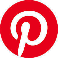
8. Pinterest
Pinterest’s brand guidelines are the most flexible on this list when it comes to color options. While the only acceptable logo is the familiar ‘P,’ you can change the colors to match your design.
The only color restrictions are related to the color fills. You can use solid colors only, and the ‘P’ must always be consistent with the background color.
When it comes to copywriting, you will need to skim through the brand guidelines to get a sense of how you can advertise your page.
  |
  |
Don’ts - Use the logo to promote your page.
- Use a CTA that displays your Pinterest account.
- Buttons in CTAs should link to your account with either a solid or outlined design.
- “Find us on” and “Follow us on” are the appropriate references.
- You can also say “Find more ideas on,” “Get inspired on,” and “Popular on.”
- Always keep the “P” in the circle container.
- Non-interactive elements should include your account name.
- Don’t use the Pinterest wordmark.
- Don’t say “Trending on” or “Trending Pins.”
- Don’t make alterations, outlines, filters, or effects.
- Don’t specifically mention Pinterest when sharing your full page URL.
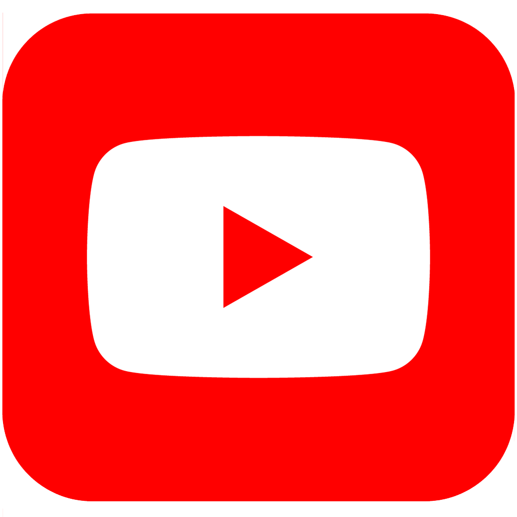
9. YouTube
It will come as no surprise that YouTube has multiple logos that feature the play icon. With a long wordmark, this shorthand will help you discreetly place the icon in your header or footer.
Each YouTube social media icon comes in black, white, and red variations.
One frustrating thing about the Google family of products is its rigid approach to brand guidelines. It was quite surprising to discover that YouTube is one of the few Google products to offer an asset pack. However, YouTube also asks you to complete a formal brand request before using the icons to promote your channel.
  |
  |
Don’ts - The logo needs safe space that is at least equal to the size of the “play” icon in the logo.
- The minimum height is 20dp
- Use the play icon if the logo is too large.
- You can only use the logo and icon to link to a YouTube channel.
- Don’t make any changes to the spacing between the icon and the word or the letters within the word.
- Don’t change colors, typeface or the shape of the logo.
- Don’t use the logo in a phrase or a sentence.
- Don’t change the number of triangles, add patterns, or use words.
10. Google
As mentioned above, Google doesn’t have a user-friendly approach to social media icons. Unfortunately, use of the official Google logo is restricted to official partners and sponsored events.
However, you can use their icons to support your product if it works with Google products. Unfortunately, there isn’t a one-stop location for the product icons, so you will need to download them individually. Just be sure to use the most recent ones.
When using Google product icons, you will need to use the full-color version in most instances. However, some exceptions can be made for grey or white.
It can get very complicated once you decide to use the icons.
  |
  |
  |
  |
  |
  |
Don’ts - The logo should be used to support your product, not sell it.
- Maintain a strong visual hierarchy with your brand icon dominating the page.
- Your copy must reflect that your product is “made for” or “works with” the Google product.
- Don’t modify, change, or distort the colors.
- Don’t use the name in your product name.
- Don’t use Google icons on merchandising.
- Don’t use the icons in a sentence or as words.
- Don’t mimic Google’s color scheme.
- Don’t overstate your relationship with Google or its products.
Conclusion
Now you know where to find the icons, it will be easier to maintain the crisp, professional look the platforms have built over several years (and decades).
It might even be an excellent time to undertake a social media audit of your online communication. While you’re unlikely to be sued if you’re using off-brand icons, for designers and social media professionals, using the right icons is about attention to detail and professionalism.
Have any questions about using these social media icons? Ask away in the comments below!
The post Social Media Icons: The Only “Approved” Icons by Each Social Media Site appeared first on Revive Social.